Ryan McGinness Reimagines The ‘We ❤️ NYC’ Logo
A PDF version of this document with embedded text is available at the link below:
Download the original document (pdf)
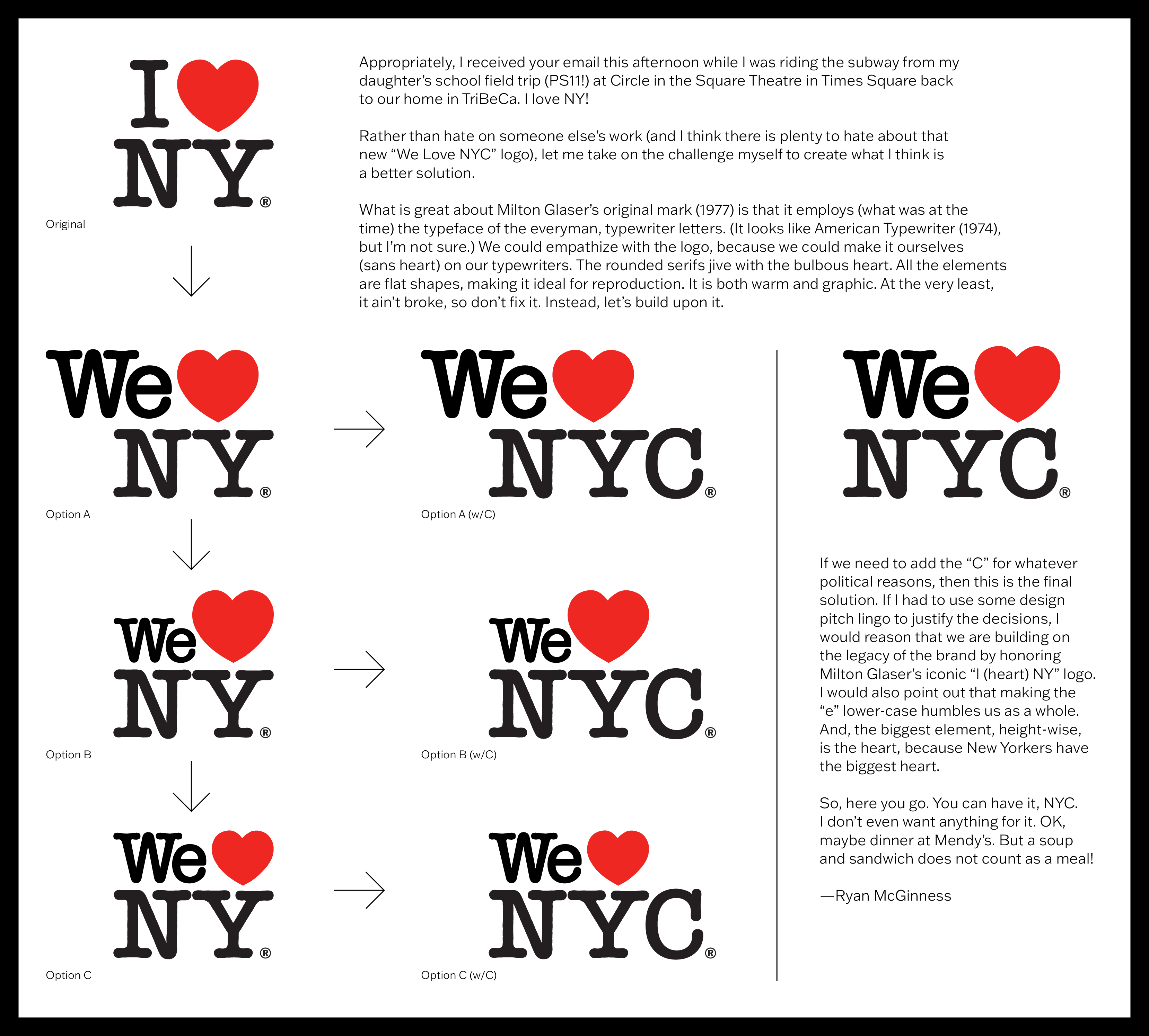
Original We❤ NY Option A Option B I❤ NY Option C We NY We NY Appropriately, I received your email this afternoon while I was riding the subway from my daughter's school field trip (PS11!) at Circle in the Square Theatre in Times Square back to our home in TriBeCa. I love NY! Rather than hate on someone else's work (and I think there is plenty to hate about that new "We Love NYC" logo), let me take on the challenge myself to create what I think is a better solution. What is great about Milton Glaser's original mark (1977) is that it employs (what was at the time) the typeface of the everyman, typewriter letters. (It looks like American Typewriter (1974), but I'm not sure.) We could empathize with the logo, because we could make it ourselves (sans heart) on our typewriters. The rounded serifs jive with the bulbous heart. All the elements are flat shapes, making it ideal for reproduction. It is both warm and graphic. At the very least, it ain't broke, so don't fix it. Instead, let's build upon it. We❤ NYC Option A (w/C) We NYC Option B (w/C) We NYC Option C (w/C) We NYC Ⓡ If we need to add the "C" for whatever political reasons, then this is the final solution. If I had to use some design pitch lingo to justify the decisions, I would reason that we are building on the legacy of the brand by honoring Milton Glaser's iconic "I (heart) NY" logo. I would also point out that making the "e" lower-case humbles us as a whole. And, the biggest element, height-wise, is the heart, because New Yorkers have the biggest heart. So, here you go. You can have it, NYC. I don't even want anything for it. OK, maybe dinner at Mendy's. But a soup and sandwich does not count as a meal! -Ryan McGinness
……Read full article on The New York Times-NY
America
Comments
Leave a comment in Nestia App